Menu

Monday, January 26, 2015

Site Selection for Heathcare Enrollment Support
(Using ACS Data)

While working with a team in a competition held by the University of Pennsylvania's Fels Institute of Public Policy, we wanted to create a tool that would conduct a site selection analysis to identify a focus area for our submission.  Our overall project goal was to develop a strategy that can analyze the healthcare information added recently in the American Community Survey (ACS) and identify a focus area during the following healthcare enrollment period.  A tailored approach would then be selected within the area to increase enrollment rates and provide support in picking the best plan for each individual/family.  The advantage of developing a tool like this is that it would be cheap to create and implement, and could provide analysis for any town/city/area since it uses ACS data which is standard throughout the country.

We identified 4 factors from the ACS to be used for site selection:

1. Highest total number of households whose incomes were between 138-399% of the federal poverty level.

2. Greatest number of persons within the 25-34  age range as identified on the ACS.

3. High levels of persons employed but without healthcare.

4. High totals of persons whose healthcare is purchased through the public exchanges.


The totals  for each factor were divided into thirds and a score of 1 to 3 was assigned to each factor as are illustrated below:


The geographical area used within these factors are the 2010 U.S. Census tracts for Philadelphia.  However this approach can be applied to census tracts in other cities and regions as well.

To pick the best particular sites within high scoring areas, the score for each census tract was combined with the scores of its neighbors.  Then the total score in a tract was divided by the total number of neighboring tracts to create an average. As a result, a large tract such as the one in the center of Philadelphia that contains the large green swath of Fairmount Park, and neighbors about 20 different census tracts is left with average score comparable to a small tract with only 5 neighbors. The end result of this process will identify the census tracts with a high score that are also surrounded by the best group of other tracts that scored highly as well.

Below are the results of the final site selection analysis:


Based on this site selected we have 2 different approaches:

1.  One approach for a small clustered area.

The southern site reflects this type of result. The best approach for signup and advising support in this area may be to open an on-site enrollment station within a library or other public setting.  The dense compact geography of this site could thereby be suitable for one central site that people can walk to for one-on-one support.

2. And a different approach for a dispersed geographic region.

The area to the north is fairly large and spread out over a wide area.  In this case opening one on-site center may not be the most efficient way to reach our target group. Instead we may look to open a call center (or in an area with high internet usage a website tool with live chat), and mailed materials or flyers that communicate the availability and contact information for our virtual support option.

Starting in 2013 the ACS has added additional questions to its survey to collect data on the availability of internet and computing in households.  A selected approach for either dense clustered sites, or more dispersed area could be tailored even further depending on the results of this additional information.


Modeling Assumptions and Groundrules

There were however a few issues and assumptions used with the ACS data.  The first to note is the margin of error.  The ACS is a statistical survey about a region.  In this case the geography is a census tract.  However since the surveys have just started and do not have a complete collection of data, the 5 year ACS, may only have information from these questions from within the past 2-3 years.  So for example, the count of uninsured persons could be listed as 52 in a tract, but the margin of error may be huge, like +/- 80.

However as the data quality increases over the next few years, this analysis process will become more effective.  Using the data today is also still a good exercise for developing a process and illustrating its usefulness. The goal of this strategy is to use common data that is publicly available from the ACS, that allows for this process to be replicated anywhere within the U.S.

Another assumption used is that the scores were not weighted.  The process could be revised for example, to weigh age and income more greatly in the final score than total persons with public healthcare. Instead in this case all of the factors were held equal.

Finally we are assuming that the various pieces of information overlap within the same groups we are attempting to target.  For example, we are assuming that separate information about high levels of younger persons overlap with the data indicating a high number of employed persons without healthcare.


(Side Note:  The color selections for the maps were chosen using colorbrewer2.org. A great resource for color palette recommendations.)

Monday, January 12, 2015

Predicting Home Prices Using Multivariate Statistical Analysis

Over the fall I created an OLS regression model as an exercise in R.  The model was built using a kitchen sink approach where you basically just throw in a ton of variables without any underlying theory and see which are statistically significant. Of course this approach will only give you results based on correlation and without an underlying theory this would not be a good way to create a model for actual prediction in the real world.  However it is a great way to practice R and go through the exercise of creating a statistical model.

Most of the variable data, such as demographics and income, was obtained from the most recent census. Home sale prices were geocoded and joined to variable data in GIS often by census tract or distance.

Other variables were also imported through various methods.  Examples included geocoded Wikipedia articles obtained through an API, the location of street trees in Philadelphia, voter turnout, and test scores of local schools.  A near table was generated in GIS for each home sale price entry that displayed the count and distance of homes from each variable point.  So for example, the total number of trees within 100 ft of a home could be calculated and summed.

Below are a few maps, the first of which shows the location of home sale prices used to train and later test the model.  The other maps depict some of the variables joined to home sale prices that proved to be statistically significant within the model.


As you might have guessed, I found that the distance of a home from Wikipedia articles did not happen to be a significant predictor of home sale prices. However voter turnout in an area was a significant factor.  The total number of votes explains something about the value of homes in an area different from all the other qualities.  Surprisingly, although trees are said to improve the value of a home or block, the model did not identify this variable as being statistically significant.

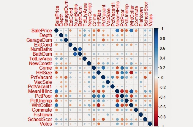
Below is a correlation matrix that can be used to visualize the relationship of each of the significant variables I identified in my final model with Sale Price:


The resulting the model accurately predicted the sampled home sale prices 52% of the time.  When tested with the cross validation tool, which removes a random sample of data the accuracy rate was sustained.  Summaries of both are show below.


Observed vs Predicted Values

As another exercise to evaluate the residuals in the model a few more charts were created below:

Above: Residuals versus Predicted Values
Above: Residuals versus Observed Values


It should be noted that home prices over $1 million were excluded from the data within the model .  Excluding these outliers made it easier to evaluate the plotted residuals contained within the appendices.  It was also easier to predict home sale prices overall as these high dollar value sales skewed the model for the rest of the data. 

After the model was completed  the residual errors were mapped out in GIS and ran through the Moran’s I tool in ArcMap to determine whether they were clustered, in which case another variable probably existed that could improve the model, or if the errors were dispersed randomly across the city.


The map above is useful to just visualize the spatial arrangement of residuals.  As later confirmed by the Moran's I test, residual errors were not significantly clustered or dispersed.

Shown are the output results from the Moran's I tool.  As shown, the model's residual errors are spatially random.


Here is one more map the depicts the values predicted within a test set.  If you are familiar with Philadelphia, you'll notice that the higher home values in dark blue, correlate with Center City and Chestnut Hill.  Both of which are desirable areas to live.  The areas in red also do correspond with lower income neighborhoods such as North Philly and areas of Southwest and West Philadelphia.


Saturday, January 10, 2015

Petty Island - The 2015 Better Philadelphia Competition

                During the fall of 2014 I joined a team to compete in The 2014 Better Philadelphia Design Competition.  The completion was hosted by the Philadelphia Center for Architecture and founded in 2006 in memory of Ed Bacon.  The subject of this year’s competition was a reimagining of the future of  Petty Island and the neighboring Philadelphia coastline to the north.  (See below for a map of the official boundaries.)  The competition called for the following elements to be included in design proposals: Site Programming, Climate Change, Transportation & Access, and Environmental Sustainability.

Above: The official site design boundaries.  The north side of the shoreline falls within Philadelphia and the southern site of Petty Island closely borders Camden, NJ. (Map from official contest webpage.)


Petty Island is a small land mass just north of the Camden on the Delaware River. It is thought to be the place where Captain Blackbeard docked when visiting Philadelphia.  It served as a haven of scum and villainy outside of the privy of the Quaker ruled city and hosted unsavory activities such as gambling, dueling, and slave trade during the 18th century.  The City Paper had a pretty fascinating cover article in 2010 about the history of the island which can be found here.

As the 20th century progressed it eventually came into the ownership of CITGO, and correspondingly Hugo Chavez and was used for fuel storage.  However, in the last couple of decades, the Venezuelan government has been looking to turn over the land on the condition that an environmental element be included in future plans.

The island has been a nesting ground for bald eagles have nested on the island. The years of industrial use on the site have left brownfield contaminants and as a result of both of these ecological and industrial factors development of the site is a complicated proposal.  As a group we sought to draw on ecology, and industry as the theme characteristic of the area's future.

Our team featured four urban designers and myself.  My work on the projected focused on creating base maps in GIS as needed to support various aspects of the design process. and also serve as a subject matter expert on the background of the surrounding area, neighborhoods, political history and landscape, and other local aspects of importance. It was a great opportunity as a non-designer to contribute ideas in the process as well.


Below are a series of base maps I created in support of design efforts.

The first of the base maps we needed was a quick map of the buildings or parcels.
(Philadelphia provides data on the actual buildings, while NJ/Camden only provided parcel data.)

A land use map was also needed early on in the process.  Our Camden site focused on conservation and ecology, while the Philadelphia side to the north aimed to create building and transportation development.  The map created was a quick guide intended to accommodate the different needs for each site.

Our designers also wanted to look at the potential flood plains to incorporate into their design.
The map above shows the 100 year floodplain per FEMA.

Finally, we wanted to integrate our site into the existing rail, bike and road transportation infrastructure.  


Petty island holds a couple densely forested areas that have served as bird sanctuaries along the river. We loved the idea of creating 3 different levels of ecological preservation and divided the island into 3 areas:  The concrete paved areas would hold most of our structures and programming, the forested areas serve as protected sites and research areas, and the remaining area served as restoration site for some active use and brownfield remediation.

The Philadelphia side of the boundary in our estimation called for a more dense urban development that incorporated ecological features.  We felt this would be an appropriate way to develop the Philadelphia portion of the design area that connected the nearby neighborhoods with their waterfront by creating critical mass of residence and commercial uses along the shore.

Of the particular features, we thought that buildings on petty island constructed of shipping containers would provide a functional advantage since these could be reconfigured regularly to accommodate different programming uses on the site.  The aesthetic appeal of this type of building material provided a quality that reflected the industrial past of the island.  The island could house university ecology programs, research and active efforts for remediation.

The Delaware River also happens to be undergoing dredging activities at this time and we discovered from advising with an ecological expert that the dredge spoils could be used to cap contaminants in the soil.  We therefore planned to focus on using this approach to remediate the northeastern shore of the island.  Other activities incorporated into the site included a bike path and boardwalk along the perimeter, and a pedestrian bridge that connected the site into the greater context of Camden's bike and rail network.  We discussed creative reuse of the storage tanks as a possible graffiti park that could open up the site for a broader array of visitors and artists.

Below is a copy of the final board we submitted to the judges.  The board itself was very large so the original file was condensed to allow it to display here without issues.

The top half illustrates the broad design and develop concepts that we held for the sites.

The bottom half of the board  illustrates (from left to right) our concept of ecological preservation and a nod to the industrial past of the area. Second it shows the remediation plan which included leveraging dredging activity and the creation of wetlands within the flood plain.  Finally we envisioned a research site and programming space within a network of buildings that could be reconfigured based on use.