Over the fall I created an OLS regression model as an
exercise in R. The model was built using a
kitchen sink approach where you basically just throw in a ton of variables without any underlying theory and see which are statistically significant. Of course this approach will only give you results based on correlation and without an underlying theory this would not be a good way to create a model for actual prediction in the real world. However it is a great way to practice R and go through the exercise of creating a statistical model.
Most of the variable data, such as demographics and income, was obtained from the most recent census. Home sale prices were geocoded and joined to variable data in GIS often by census tract or distance.
Other variables were also imported through various methods. Examples included geocoded Wikipedia articles obtained through an API, the location of street trees in Philadelphia, voter turnout, and test scores of local schools. A near table was generated in GIS for each home sale price entry that displayed the count and distance of homes from each variable point. So for example, the total number of trees within 100 ft of a home could be calculated and summed.
Below are a few maps, the first of which shows the location of home sale prices used to train and later test the model. The other maps depict some of the variables joined to home sale prices that proved to be statistically significant within the model.


As you might have guessed, I found that the distance of a home from
Wikipedia articles did not happen to be a significant predictor of home sale prices. However
voter turnout in an area was a significant factor. The total number of votes explains something about the
value of homes in an area different from all the other qualities. Surprisingly, although trees are said to improve the value of a home or block, the model did not identify this variable as being statistically significant.
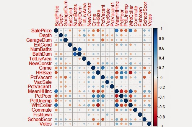
Below is a correlation matrix that can be used to visualize
the relationship of each of the significant variables I identified in my final model
with Sale Price:
The resulting the model accurately predicted the sampled home sale prices 52% of the time. When tested with the cross validation tool, which removes a random sample of data the accuracy rate was sustained. Summaries of both are show below.


 |
| Observed vs Predicted Values |
As another exercise to evaluate the residuals in the model a few more charts were created below:
 |
| Above: Residuals versus Predicted Values |
 |
| Above: Residuals versus Observed Values |
It should be noted that home prices over $1 million were excluded from the data within the model . Excluding these outliers made it easier to evaluate
the plotted residuals contained within the appendices. It was also easier to predict home sale
prices overall as these high dollar value sales skewed the model for the rest of the data.
After the model was completed the residual errors were mapped out in GIS
and ran through the Moran’s I tool in ArcMap to determine whether they were clustered, in
which case another variable probably existed that could improve the model, or
if the errors were dispersed randomly across the city.
 |
| The map above is useful to just visualize the spatial arrangement of residuals. As later confirmed by the Moran's I test, residual errors were not significantly clustered or dispersed. |
 |
Shown are the output results from the Moran's I tool. As shown, the model's residual errors are spatially random.
Here is one more map the depicts the values predicted within a test set. If you are familiar with Philadelphia, you'll notice that the higher home values in dark blue, correlate with Center City and Chestnut Hill. Both of which are desirable areas to live. The areas in red also do correspond with lower income neighborhoods such as North Philly and areas of Southwest and West Philadelphia.

No comments:
Post a Comment