Menu

Monday, November 30, 2015

Mapping Community Assets in Mumbai with Google's Places API

I mentioned earlier that I was working with a team in a design studio focused on the waterfront in Mumbai.  (Our work will be published in print and at resilientwaterfronts.org.) Mumbai is absolutely fascinating and words cannot describe what it is like to be there and see all of the activity taking place.

The island city of Mumbai is the heart of its financial and economic district. Its shape as a narrow peninsula directly impacts how the city has developed. Mumbai is twice as dense as New York City, and five times as dense as Shanghai. I've found it useful to compare Greater Mumbai and the island city to New York's five boroughs and Manhattan Island.


Within the island city, our study area is the old port on the eastern waterfront. A new modern port is currently in operation across the harbor in Navi Mumbai, and the older port on the island city has much shallower waters that can't accommodate large container ships. The focus of our studio is to study the 1,800 acres that comprise the old port that lie within the heart of one of the densest cities in the world underutilized. The government of India has been building a lot of momentum in looking at redeveloping at least 2/3 of this area.  In a city as dense and active as Mumbai, an opportunity like this is a huge one-time chance to shape the future of this city and open up even greater potential for its development.

The base map below, created by the designers in my studio team, highlights the 1,800 acre port on the eastern coast of Mumbai that we are studying:


Before traveling there we did a lot of prep work gathering data on the existing conditions. However we found that Mumbai was a case in which finding GIS data can be hard to come by.

Part of our planning process started with gathering an inventory of the existing community assets. Open streets map (OSM) has a lot of data but I found that it wasn't 100% complete, nor was it specific to the topics we wanted to focus on. I decided to use the Google Places API tool to find the data we needed to help complete a community assets inventory.

With the Google Places API I was able to search a few areas and grab results for high schools, churches/mosques/temples, and hospitals. The API however only limits you to 60 results which is unfortunate. I mitigated this restriction by defining a short radius of about a 1/4 mile around several points along the study area.  In this case we used the train stations for the Harbor Line, which runs down along the eastern coast of Mumbai.

The Google Places API has some documentation Here.  Basically you can sign up for an API key that will allow you to use the tool. Sometimes APIs, like this one area really easy to use, even if you don't have any programming knowledge at all. Basically you enter all the information you want into the search bar and fill in the various variables such as "Lat=" & ""Lon=" and then a key word or topic like "keyword=churches".  You'll get a result thats probably in XML or some other code that you can save to your computer and open in Excel using the paste special command and "Unicode text" or "XML" to format the results.

Here's an example of the url I typed in (no spaces all one long line) for a lat/long of 18.9442, 72.835 to find all the art galleries in an area:

"https://maps.googleapis.com/maps/api/place/nearbysearch/xml?location=18.9442,72.835
&radius=1000
&keyword=%22art%20gallery%28
&key=Secret_API_Key
"

APIs can be tricky and you'd need to know some programming if you wanted to include the information on a website. However if you are like me and you just want to output the data in a csv file or something simple from a series of results it can be pretty simple. You just type in the url, save it as an xml file, and then you can open it in excel.


In this case I only had about 10 points to search, and up to 3 pages of results for each. If I wanted I could have done this manually without too much time or effort.

However if you need to enter in a very long list, lets say 800 addresses, then you would want to run a script in Python or something that could automatically take that list, query all of the results for you (by plugging the address into the searchbar format that the API wants) and then downloading all of the results into a file. This can be a little trickier sometimes, but its definitely not too difficult to learn. If you are intimidated by coding, you can still use APIs by manually entering in a handful of searches.


From there the results could be placed back on a map in GIS using the Lat/Lon coordinates in the results file and here are the results:


We were able to get a decent list of results by using the this API and mapped the results.  We've since combined these results with other data, such as GIS and population density, as well as neighborhood shapefiles that we digitized into GIS from other sources.


Friday, November 27, 2015

Agent-Based Modeling with Python and ArcMap

I spent a few hours last week creating an agent-based model using Python and ESRI's ArcMap (GIS). I was inspired by a presentation I had seen last year based on a publication in the Philosophy of Science by Michael Weisberg and Ryan Muldoon.

Weisberg and Muldoon created an agent based model that compared the paths of discovery for two types of scientists: followers, and mavericks.  They wanted to identify which might be more efficient at making scientific discoveries, and create identify any interesting patterns of the "path of scientific progress" for either approach,

Basically they created an elevation layer with two peaks. The rise in elevation at a point indicated an increase of knowledge, or scientific knowledge. The peaks represented scientific discovery.

Here is a sample image of the elevation layers from their paper:


The second piece of the model added, were the "scientists." Several scientists were randomly distributed throughout the grid layer. Two different models were created in which the scientists used would all act one of two ways: they would either follow, or a maverick.

Each time a follower moved from one grid cell to the next, they "discovered" the value of that cell. Then they would look around at all 8 neighboring cells. From there followers would pick the highest value discovered when possible,

Mavericks behaved in the opposite fashion.  They would always first pick the unexplored cell if possible.   If all cells have been visited then they pick the highest value.

Weisberg and Muldoon discovered that within their model, the mavericks found the discoveries more efficiently, and more often than the followers.  When mixed with followers, mavericks also helped guide them more quickly to new areas of progress.

Here is another illustration from Weisberg and Muldoon's "Epistemic Landscapes and the Division of Cognitive Labor," It depicts (A) the paths created by a set of "followers" in the model from their starting point (B) toward the peaks:


I just spent a few hours last week creating a similar model. I did not create the layer of logic that would create decisions as complex as the mavericks or followers but I did create an agent based model in which a "scientist" would move around specific locations of a grid until it found the point of highest elevation. In place of complex decision making, I instead moved the scientist randomly among the neighboring cells. I also made sure that the agent would not backtrack a cell already traveled, nor would the scientist move off of they boundaries of the grid.

Here is an excerpt of my script, but the entire text can be downloaded (as a py file) HERE.


The final result of my model could consistently find the highest point of elevation, however you'll be able to see that the path was extremely inefficient.  The "scientist" explored nearly the entire grid in this example before finding the highest point.

White: Explored areas. Gray are lower value and white higher.
Black: Unexplored.


Weisberg and Muldoon's paper, "Epistemic Landscapes and the Division of Cognitive Labor," published in the journal of Philosophy of Science, can be found HERE.


Thursday, November 19, 2015

Constructing 3D site models.

I am currently going through some of the introductory aspects of site planning. The process has shown how useful it is to create a 3D model in order to gain some insight into the scale of an area and its surroundings.

As an exercise I am studying the area at 11th and Market, which is currently the site of the proposed East Market development currently under construction:


I quickly took the building footprints layer and through a series of steps exported the layers from GIS to Sketchup. I then just extruded the layers up to the total building heights. Sketchup is pretty amazing and with a little more time, you can really make some great 3D renderings of a concept. This model was a quick, simple example to create a sense of scale for the area. (For city hall, I went ahead and grabbed a previously built model, that had some finer details of the building from Sketchup's model warehouse and scale it into this model.)


In addition to the 3D model that you can zoom in and view, I also placed the building footprints into Auto CAD, and laid out a template to send to our laser cutter. A number of layers were set up to score the building footprints in the base, and also cut out a number of layers of the footprints themselves to glue and stack on one another.  Pictured below are a few photos of the before and after process of creating the model from 1/16" chipboard.


Tuesday, November 3, 2015

Updates Coming Soon....

Its been a while since I posted on here, but I have a bunch of updates coming.

Here are a few topics that I plan to post about:


Mumbai's Eastern Waterfront:

I've been working with a group to develop a possible future plan for the development of Mumbai's eastern waterfront.  Over recent years India's government officials have begun to seriously consider opening up at least 1,000 acres of this underutilized area to future public development.

Out work has included analysis of existing conditions, research on site, and we are currently working on a future master plan for the development of the area.

Our work is part of a series of studio workshops that will be published online at: http://resilientwaterfronts.org/


Building "From Scratch"

I'll be writing about a few sources and methods to creating data for analysis in areas where GIS and other data might be commonly available.  I'll look at sources such as OSM, Google's APIs, digitizing and image classification, on site data collection.  Additionally I'll cover some examples of interpreting data, forecasts and reports into tailored graphs and visualizations.

Site Planning

Some samples of an introduction to site planning.  Includes applications in CAD, Sketchup and creating a 3D site model.

"What Lies Beneath"

My summer photography project has been finalized and I will be running prints in December.  Photos of the final product and related activities will be posted soon.


Finally, I've found some pretty stark differences between looking something up online, and seeing it in person.  Here's one illustration of what I found:


Thursday, May 21, 2015

Summer Fun (and Manhole Covers)!

Summer is finally here which means a little more free time and some extra pep in my step from the weather and sunshine.  I'm hoping to make ground on a couple projects.   One for fun and another to build off mapping and data visualization and put it all on the web in an interactive format.


Here's a preview of the progress on my current "for fun" project:

Every city is filled with variety and history wherever you look.  From the cornices and windows, to architecture, even in something as simple as a sewer cover.  After a few weeks of hunting around I've gotten about halfway to my goal of finding between 60 and 100 different sewer covers.  When I'm done I'll touch them up and make a few prints of the collage.

One of my favorites that I find pretty frequently is the PTC cover.  These are from the pre-Septa days when the Philadelphia Trolley Company was still in town.

Finding the second half will probably be a summer long scavenger hunt but I'll gladly take any excuse to bike around in the sun.


Monday, January 26, 2015

Site Selection for Heathcare Enrollment Support
(Using ACS Data)

While working with a team in a competition held by the University of Pennsylvania's Fels Institute of Public Policy, we wanted to create a tool that would conduct a site selection analysis to identify a focus area for our submission.  Our overall project goal was to develop a strategy that can analyze the healthcare information added recently in the American Community Survey (ACS) and identify a focus area during the following healthcare enrollment period.  A tailored approach would then be selected within the area to increase enrollment rates and provide support in picking the best plan for each individual/family.  The advantage of developing a tool like this is that it would be cheap to create and implement, and could provide analysis for any town/city/area since it uses ACS data which is standard throughout the country.

We identified 4 factors from the ACS to be used for site selection:

1. Highest total number of households whose incomes were between 138-399% of the federal poverty level.

2. Greatest number of persons within the 25-34  age range as identified on the ACS.

3. High levels of persons employed but without healthcare.

4. High totals of persons whose healthcare is purchased through the public exchanges.


The totals  for each factor were divided into thirds and a score of 1 to 3 was assigned to each factor as are illustrated below:


The geographical area used within these factors are the 2010 U.S. Census tracts for Philadelphia.  However this approach can be applied to census tracts in other cities and regions as well.

To pick the best particular sites within high scoring areas, the score for each census tract was combined with the scores of its neighbors.  Then the total score in a tract was divided by the total number of neighboring tracts to create an average. As a result, a large tract such as the one in the center of Philadelphia that contains the large green swath of Fairmount Park, and neighbors about 20 different census tracts is left with average score comparable to a small tract with only 5 neighbors. The end result of this process will identify the census tracts with a high score that are also surrounded by the best group of other tracts that scored highly as well.

Below are the results of the final site selection analysis:


Based on this site selected we have 2 different approaches:

1.  One approach for a small clustered area.

The southern site reflects this type of result. The best approach for signup and advising support in this area may be to open an on-site enrollment station within a library or other public setting.  The dense compact geography of this site could thereby be suitable for one central site that people can walk to for one-on-one support.

2. And a different approach for a dispersed geographic region.

The area to the north is fairly large and spread out over a wide area.  In this case opening one on-site center may not be the most efficient way to reach our target group. Instead we may look to open a call center (or in an area with high internet usage a website tool with live chat), and mailed materials or flyers that communicate the availability and contact information for our virtual support option.

Starting in 2013 the ACS has added additional questions to its survey to collect data on the availability of internet and computing in households.  A selected approach for either dense clustered sites, or more dispersed area could be tailored even further depending on the results of this additional information.


Modeling Assumptions and Groundrules

There were however a few issues and assumptions used with the ACS data.  The first to note is the margin of error.  The ACS is a statistical survey about a region.  In this case the geography is a census tract.  However since the surveys have just started and do not have a complete collection of data, the 5 year ACS, may only have information from these questions from within the past 2-3 years.  So for example, the count of uninsured persons could be listed as 52 in a tract, but the margin of error may be huge, like +/- 80.

However as the data quality increases over the next few years, this analysis process will become more effective.  Using the data today is also still a good exercise for developing a process and illustrating its usefulness. The goal of this strategy is to use common data that is publicly available from the ACS, that allows for this process to be replicated anywhere within the U.S.

Another assumption used is that the scores were not weighted.  The process could be revised for example, to weigh age and income more greatly in the final score than total persons with public healthcare. Instead in this case all of the factors were held equal.

Finally we are assuming that the various pieces of information overlap within the same groups we are attempting to target.  For example, we are assuming that separate information about high levels of younger persons overlap with the data indicating a high number of employed persons without healthcare.


(Side Note:  The color selections for the maps were chosen using colorbrewer2.org. A great resource for color palette recommendations.)

Monday, January 12, 2015

Predicting Home Prices Using Multivariate Statistical Analysis

Over the fall I created an OLS regression model as an exercise in R.  The model was built using a kitchen sink approach where you basically just throw in a ton of variables without any underlying theory and see which are statistically significant. Of course this approach will only give you results based on correlation and without an underlying theory this would not be a good way to create a model for actual prediction in the real world.  However it is a great way to practice R and go through the exercise of creating a statistical model.

Most of the variable data, such as demographics and income, was obtained from the most recent census. Home sale prices were geocoded and joined to variable data in GIS often by census tract or distance.

Other variables were also imported through various methods.  Examples included geocoded Wikipedia articles obtained through an API, the location of street trees in Philadelphia, voter turnout, and test scores of local schools.  A near table was generated in GIS for each home sale price entry that displayed the count and distance of homes from each variable point.  So for example, the total number of trees within 100 ft of a home could be calculated and summed.

Below are a few maps, the first of which shows the location of home sale prices used to train and later test the model.  The other maps depict some of the variables joined to home sale prices that proved to be statistically significant within the model.


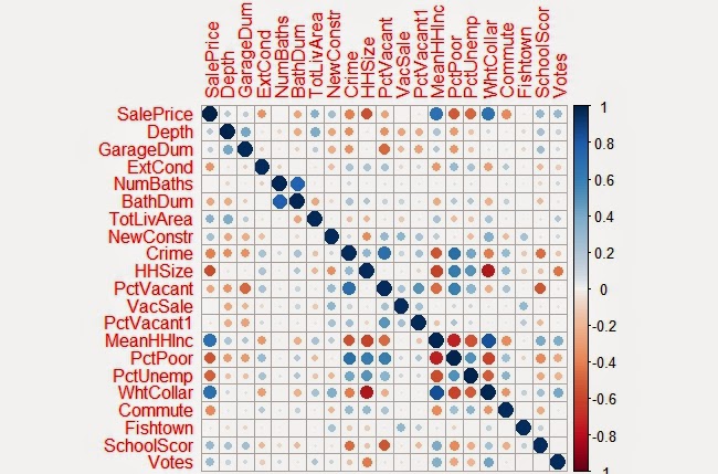
As you might have guessed, I found that the distance of a home from Wikipedia articles did not happen to be a significant predictor of home sale prices. However voter turnout in an area was a significant factor.  The total number of votes explains something about the value of homes in an area different from all the other qualities.  Surprisingly, although trees are said to improve the value of a home or block, the model did not identify this variable as being statistically significant.

Below is a correlation matrix that can be used to visualize the relationship of each of the significant variables I identified in my final model with Sale Price:


The resulting the model accurately predicted the sampled home sale prices 52% of the time.  When tested with the cross validation tool, which removes a random sample of data the accuracy rate was sustained.  Summaries of both are show below.


Observed vs Predicted Values

As another exercise to evaluate the residuals in the model a few more charts were created below:

Above: Residuals versus Predicted Values
Above: Residuals versus Observed Values


It should be noted that home prices over $1 million were excluded from the data within the model .  Excluding these outliers made it easier to evaluate the plotted residuals contained within the appendices.  It was also easier to predict home sale prices overall as these high dollar value sales skewed the model for the rest of the data. 

After the model was completed  the residual errors were mapped out in GIS and ran through the Moran’s I tool in ArcMap to determine whether they were clustered, in which case another variable probably existed that could improve the model, or if the errors were dispersed randomly across the city.


The map above is useful to just visualize the spatial arrangement of residuals.  As later confirmed by the Moran's I test, residual errors were not significantly clustered or dispersed.

Shown are the output results from the Moran's I tool.  As shown, the model's residual errors are spatially random.


Here is one more map the depicts the values predicted within a test set.  If you are familiar with Philadelphia, you'll notice that the higher home values in dark blue, correlate with Center City and Chestnut Hill.  Both of which are desirable areas to live.  The areas in red also do correspond with lower income neighborhoods such as North Philly and areas of Southwest and West Philadelphia.


Saturday, January 10, 2015

Petty Island - The 2015 Better Philadelphia Competition

                During the fall of 2014 I joined a team to compete in The 2014 Better Philadelphia Design Competition.  The completion was hosted by the Philadelphia Center for Architecture and founded in 2006 in memory of Ed Bacon.  The subject of this year’s competition was a reimagining of the future of  Petty Island and the neighboring Philadelphia coastline to the north.  (See below for a map of the official boundaries.)  The competition called for the following elements to be included in design proposals: Site Programming, Climate Change, Transportation & Access, and Environmental Sustainability.

Above: The official site design boundaries.  The north side of the shoreline falls within Philadelphia and the southern site of Petty Island closely borders Camden, NJ. (Map from official contest webpage.)


Petty Island is a small land mass just north of the Camden on the Delaware River. It is thought to be the place where Captain Blackbeard docked when visiting Philadelphia.  It served as a haven of scum and villainy outside of the privy of the Quaker ruled city and hosted unsavory activities such as gambling, dueling, and slave trade during the 18th century.  The City Paper had a pretty fascinating cover article in 2010 about the history of the island which can be found here.

As the 20th century progressed it eventually came into the ownership of CITGO, and correspondingly Hugo Chavez and was used for fuel storage.  However, in the last couple of decades, the Venezuelan government has been looking to turn over the land on the condition that an environmental element be included in future plans.

The island has been a nesting ground for bald eagles have nested on the island. The years of industrial use on the site have left brownfield contaminants and as a result of both of these ecological and industrial factors development of the site is a complicated proposal.  As a group we sought to draw on ecology, and industry as the theme characteristic of the area's future.

Our team featured four urban designers and myself.  My work on the projected focused on creating base maps in GIS as needed to support various aspects of the design process. and also serve as a subject matter expert on the background of the surrounding area, neighborhoods, political history and landscape, and other local aspects of importance. It was a great opportunity as a non-designer to contribute ideas in the process as well.


Below are a series of base maps I created in support of design efforts.

The first of the base maps we needed was a quick map of the buildings or parcels.
(Philadelphia provides data on the actual buildings, while NJ/Camden only provided parcel data.)

A land use map was also needed early on in the process.  Our Camden site focused on conservation and ecology, while the Philadelphia side to the north aimed to create building and transportation development.  The map created was a quick guide intended to accommodate the different needs for each site.

Our designers also wanted to look at the potential flood plains to incorporate into their design.
The map above shows the 100 year floodplain per FEMA.

Finally, we wanted to integrate our site into the existing rail, bike and road transportation infrastructure.  


Petty island holds a couple densely forested areas that have served as bird sanctuaries along the river. We loved the idea of creating 3 different levels of ecological preservation and divided the island into 3 areas:  The concrete paved areas would hold most of our structures and programming, the forested areas serve as protected sites and research areas, and the remaining area served as restoration site for some active use and brownfield remediation.

The Philadelphia side of the boundary in our estimation called for a more dense urban development that incorporated ecological features.  We felt this would be an appropriate way to develop the Philadelphia portion of the design area that connected the nearby neighborhoods with their waterfront by creating critical mass of residence and commercial uses along the shore.

Of the particular features, we thought that buildings on petty island constructed of shipping containers would provide a functional advantage since these could be reconfigured regularly to accommodate different programming uses on the site.  The aesthetic appeal of this type of building material provided a quality that reflected the industrial past of the island.  The island could house university ecology programs, research and active efforts for remediation.

The Delaware River also happens to be undergoing dredging activities at this time and we discovered from advising with an ecological expert that the dredge spoils could be used to cap contaminants in the soil.  We therefore planned to focus on using this approach to remediate the northeastern shore of the island.  Other activities incorporated into the site included a bike path and boardwalk along the perimeter, and a pedestrian bridge that connected the site into the greater context of Camden's bike and rail network.  We discussed creative reuse of the storage tanks as a possible graffiti park that could open up the site for a broader array of visitors and artists.

Below is a copy of the final board we submitted to the judges.  The board itself was very large so the original file was condensed to allow it to display here without issues.

The top half illustrates the broad design and develop concepts that we held for the sites.

The bottom half of the board  illustrates (from left to right) our concept of ecological preservation and a nod to the industrial past of the area. Second it shows the remediation plan which included leveraging dredging activity and the creation of wetlands within the flood plain.  Finally we envisioned a research site and programming space within a network of buildings that could be reconfigured based on use.