Menu

Showing posts with label ArcMap. Show all posts

Monday, January 26, 2015

Site Selection for Heathcare Enrollment Support
(Using ACS Data)

While working with a team in a competition held by the University of Pennsylvania's Fels Institute of Public Policy, we wanted to create a tool that would conduct a site selection analysis to identify a focus area for our submission.  Our overall project goal was to develop a strategy that can analyze the healthcare information added recently in the American Community Survey (ACS) and identify a focus area during the following healthcare enrollment period.  A tailored approach would then be selected within the area to increase enrollment rates and provide support in picking the best plan for each individual/family.  The advantage of developing a tool like this is that it would be cheap to create and implement, and could provide analysis for any town/city/area since it uses ACS data which is standard throughout the country.

We identified 4 factors from the ACS to be used for site selection:

1. Highest total number of households whose incomes were between 138-399% of the federal poverty level.

2. Greatest number of persons within the 25-34  age range as identified on the ACS.

3. High levels of persons employed but without healthcare.

4. High totals of persons whose healthcare is purchased through the public exchanges.


The totals  for each factor were divided into thirds and a score of 1 to 3 was assigned to each factor as are illustrated below:


The geographical area used within these factors are the 2010 U.S. Census tracts for Philadelphia.  However this approach can be applied to census tracts in other cities and regions as well.

To pick the best particular sites within high scoring areas, the score for each census tract was combined with the scores of its neighbors.  Then the total score in a tract was divided by the total number of neighboring tracts to create an average. As a result, a large tract such as the one in the center of Philadelphia that contains the large green swath of Fairmount Park, and neighbors about 20 different census tracts is left with average score comparable to a small tract with only 5 neighbors. The end result of this process will identify the census tracts with a high score that are also surrounded by the best group of other tracts that scored highly as well.

Below are the results of the final site selection analysis:


Based on this site selected we have 2 different approaches:

1.  One approach for a small clustered area.

The southern site reflects this type of result. The best approach for signup and advising support in this area may be to open an on-site enrollment station within a library or other public setting.  The dense compact geography of this site could thereby be suitable for one central site that people can walk to for one-on-one support.

2. And a different approach for a dispersed geographic region.

The area to the north is fairly large and spread out over a wide area.  In this case opening one on-site center may not be the most efficient way to reach our target group. Instead we may look to open a call center (or in an area with high internet usage a website tool with live chat), and mailed materials or flyers that communicate the availability and contact information for our virtual support option.

Starting in 2013 the ACS has added additional questions to its survey to collect data on the availability of internet and computing in households.  A selected approach for either dense clustered sites, or more dispersed area could be tailored even further depending on the results of this additional information.


Modeling Assumptions and Groundrules

There were however a few issues and assumptions used with the ACS data.  The first to note is the margin of error.  The ACS is a statistical survey about a region.  In this case the geography is a census tract.  However since the surveys have just started and do not have a complete collection of data, the 5 year ACS, may only have information from these questions from within the past 2-3 years.  So for example, the count of uninsured persons could be listed as 52 in a tract, but the margin of error may be huge, like +/- 80.

However as the data quality increases over the next few years, this analysis process will become more effective.  Using the data today is also still a good exercise for developing a process and illustrating its usefulness. The goal of this strategy is to use common data that is publicly available from the ACS, that allows for this process to be replicated anywhere within the U.S.

Another assumption used is that the scores were not weighted.  The process could be revised for example, to weigh age and income more greatly in the final score than total persons with public healthcare. Instead in this case all of the factors were held equal.

Finally we are assuming that the various pieces of information overlap within the same groups we are attempting to target.  For example, we are assuming that separate information about high levels of younger persons overlap with the data indicating a high number of employed persons without healthcare.


(Side Note:  The color selections for the maps were chosen using colorbrewer2.org. A great resource for color palette recommendations.)

Monday, January 12, 2015

Predicting Home Prices Using Multivariate Statistical Analysis

Over the fall I created an OLS regression model as an exercise in R.  The model was built using a kitchen sink approach where you basically just throw in a ton of variables without any underlying theory and see which are statistically significant. Of course this approach will only give you results based on correlation and without an underlying theory this would not be a good way to create a model for actual prediction in the real world.  However it is a great way to practice R and go through the exercise of creating a statistical model.

Most of the variable data, such as demographics and income, was obtained from the most recent census. Home sale prices were geocoded and joined to variable data in GIS often by census tract or distance.

Other variables were also imported through various methods.  Examples included geocoded Wikipedia articles obtained through an API, the location of street trees in Philadelphia, voter turnout, and test scores of local schools.  A near table was generated in GIS for each home sale price entry that displayed the count and distance of homes from each variable point.  So for example, the total number of trees within 100 ft of a home could be calculated and summed.

Below are a few maps, the first of which shows the location of home sale prices used to train and later test the model.  The other maps depict some of the variables joined to home sale prices that proved to be statistically significant within the model.


As you might have guessed, I found that the distance of a home from Wikipedia articles did not happen to be a significant predictor of home sale prices. However voter turnout in an area was a significant factor.  The total number of votes explains something about the value of homes in an area different from all the other qualities.  Surprisingly, although trees are said to improve the value of a home or block, the model did not identify this variable as being statistically significant.

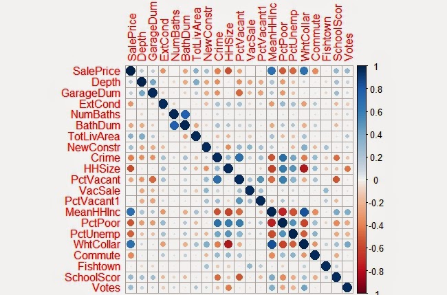
Below is a correlation matrix that can be used to visualize the relationship of each of the significant variables I identified in my final model with Sale Price:


The resulting the model accurately predicted the sampled home sale prices 52% of the time.  When tested with the cross validation tool, which removes a random sample of data the accuracy rate was sustained.  Summaries of both are show below.


Observed vs Predicted Values

As another exercise to evaluate the residuals in the model a few more charts were created below:

Above: Residuals versus Predicted Values
Above: Residuals versus Observed Values


It should be noted that home prices over $1 million were excluded from the data within the model .  Excluding these outliers made it easier to evaluate the plotted residuals contained within the appendices.  It was also easier to predict home sale prices overall as these high dollar value sales skewed the model for the rest of the data. 

After the model was completed  the residual errors were mapped out in GIS and ran through the Moran’s I tool in ArcMap to determine whether they were clustered, in which case another variable probably existed that could improve the model, or if the errors were dispersed randomly across the city.


The map above is useful to just visualize the spatial arrangement of residuals.  As later confirmed by the Moran's I test, residual errors were not significantly clustered or dispersed.

Shown are the output results from the Moran's I tool.  As shown, the model's residual errors are spatially random.


Here is one more map the depicts the values predicted within a test set.  If you are familiar with Philadelphia, you'll notice that the higher home values in dark blue, correlate with Center City and Chestnut Hill.  Both of which are desirable areas to live.  The areas in red also do correspond with lower income neighborhoods such as North Philly and areas of Southwest and West Philadelphia.


Saturday, November 1, 2014

Remote Sensing Using Multispectral Analysis

I was pretty stoked to be able to learn how to use remote sensing tools in GIS. To determine the growth in urban land cover, I used multispectral imaging and analysis to compare two images of Mombasa, Kenya from 1992 and 2014.

GIS software can identify urban and non-urban land cover, and combine the two images and measure the growth in urban land cover. Over 12 years the city grew by 86% in land over. According to the Kenya census, the population also doubled from about 460,000 people to a million during that same period.

How does Remote Sensing and Multispectral Mapping actually work? Below is a 3 min video from a guy in a turtleneck explaining it:


GIS software has the ability to identify different patterns of images on maps, and pick our urban land, vegetation, water and other uses. The tools in Arcmap can conduct both supervised and unsupervised classifications.  When unsupervised, the tool will basically go through and classify all of the various patterns it finds on its own.  Since computers aren't as smart as people on their own as picking out patterns, this can lead to a lot of patterns output and the results might not be very enlightening.

However under a supervised classification you can train GIS by selecting samples of an area that represent the pattern for each type of land cover.  So you can select urban and vegetation, water, or desert for example. Now when you run the tool the software will try to match each area to the closest example that you used to train the model  (In my example below this is what I did.)  The power of this tool is pretty extraordinary if you combine it with machine learning, or other data such as the specific light frequencies available from USGS Landsat data.

USGS satellites  have the ability to separate images into various light bands. This is an incredibly useful tool for making patterns of certain features much more pronounced and easy to train a model to identify. Using both visible light, as well as infrared and heat imagery, you can combine different combinations to more clearly identify differentiate objects. Combining two different bands can filter out the shaded side of a hill, and leave a unique signature of the rocks and plants in the area. A false color image can create stark a contrast that delineates urban and non-urban areas.  It should be noted that using light frequencies allow for you to filter out shadows and other features and define features clearly.

Each pixel has a value and when you assign a false color (Red, Green, or Blue), that value is represented as a shade of that color.  However those number values are real frequencies in the light spectrum across the band selected.  If you knew the exact frequency of light reflected from a particular plant, you could use this process to highlight those specifically from everything else including other types of plants in the image.


Below are several false color images of a few combinations that can be created using different bands. Notice how in the first, urban land is green and different geological features are shades of red.  The image in the bottom left of the graphic shows different ocean depths and the reef clearly.  Each combination of light bands highlights different types of features.


The next images shown are the analysis for the two different time periods. The small images show the satellite image of the bands used (5,4,3) and the large images show the classification of land cover that was completed using image analysis tools in GIS. The area identified in red for 2014 denotes the new urban land cover that grew over that period while the pink areas illustrate the original urban area. 

Each pixel represents a square area 30m by 30m.  The total growth in area therefore can be computed by simply counting the total red (New Urban Growth) and pink (Original Urban Cover) pixels.


Here is a list of all the different band combinations and uses for each.